Mokavit
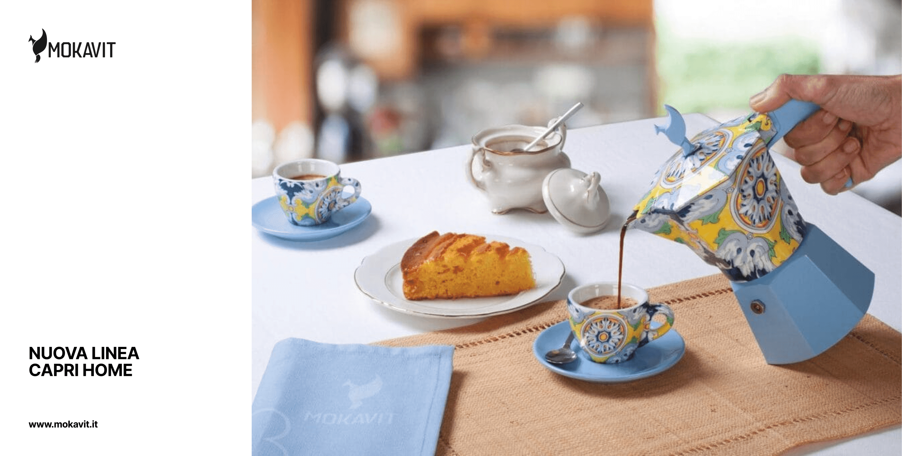
Mokavit is an Italian coffee brand inspired by the ritual and cultural heritage surrounding the moka pot. Based near my hometown in the Italian Alps, the project focused on creating a contemporary identity deeply connected to local tradition and Italian coffee culture.
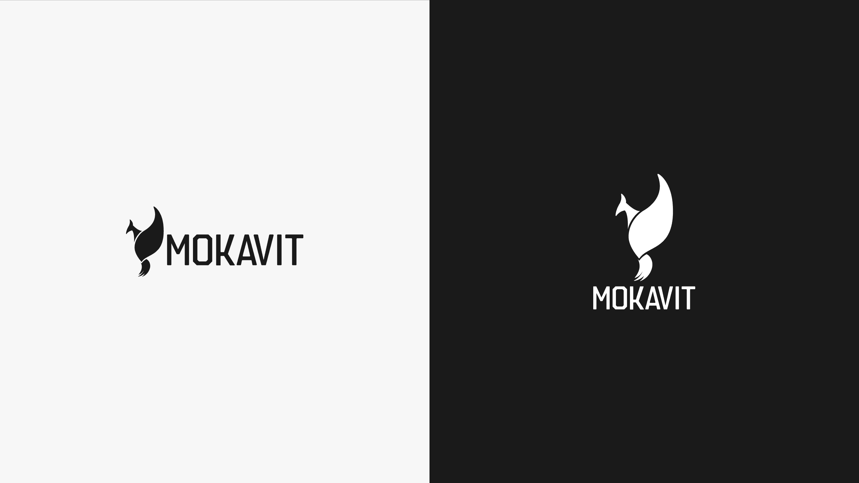
The logotype references the octagonal shape of the moka pot, while the phoenix symbol represents fire, transformation and rebirth, reflecting both the ritual of coffee preparation and the revival of the moka culture within the region.
The moka was once an object that brought work, prosperity and identity to the local territory, and part of the brand vision was to restore its cultural value through a stronger and more recognisable visual identity.
Today the brand continues expanding internationally through collaborations, athletes and public figures.
Client
Mokavit, Italy
Disciplines
Visual Identity / Logo Design
Year
2023
Scroll down